
Portfolio
BRANDING

The Wildlife Preservation Fund is a charity dedicated to safeguarding the vibrant underwater ecosystems of Lombok in Indonesia. Their brand identity is warm, inviting and trustworthy.
The logo emblem is inspired by the flowing shapes of the ocean current and the Yin & Yang symbol which illustrates the importance of balance. The Lombok marine life is integrated naturally into the a protective bubble shape to symbolise the goal of maintaining a natural home for them. Although, I think the seahorse hiding in the WPF lettermark is just showing off her camouflage superpower.
Fun Fact: Some species of seahorse can develop skin filaments or bumps to mimic the textures of algae, seaweed, or corals.

GRAPHIC DESIGN

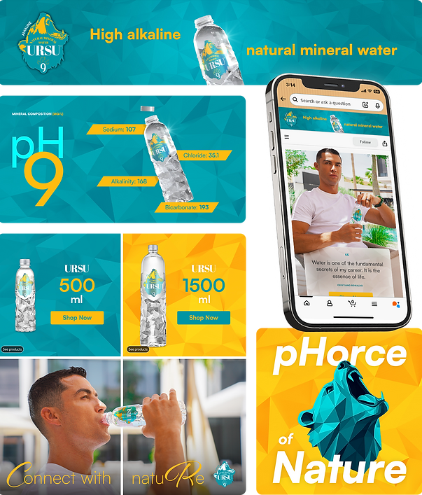
Ursu 9 is a premium, naturally alkaline mineral water brand owned by Cristiano Ronaldo, featuring a pH of 9 and sourced from the Ávila Mountains in Spain. The brand identity is clean, fresh and stylish. I was entrusted to create the UK Amazon marketing content for the brand. The bottle has a distinctive geometric design that I honoured in the background patterns within the Amazon storefront.
On the Home page, I created a subtle optical illusion effect to help the viewer remember the brand. The square tile composition is broken as we see Ronaldo ‘connecting’ across the tiles with the water and the text highlighting his initials.
Fun Fact: Ronaldo is the first male player to score a goal in five different World Cups.

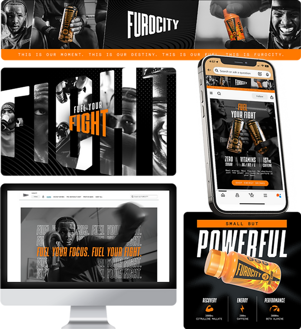
Furocity by Tyson Fury sells energy drinks and protein bars. Their brand voice is powerful and raw with a focus on performance, and community so I chose gritty textures and a bold contrasting colour palette for their Amazon marketing.
Elements break free from their frame and overlap above text to create a sense of depth and dynamic energy. The lifestyle photography is enlarged and used as backgrounds for the banners to make sure the sports performance and community spirit shines through.
I’ve used a black & white spot colour effect to add even more contrast and emphasise the strength and power of the product.
FILM
POSTERS
I’ve loved films my whole life and this on-going film poster series is one of my passion projects.
It could get quite boring in between show times when I worked at a cinema as a teenager so I would draw the film posters on the back of my schedule. If you finished your popcorn too quickly and had to rush out to get some more, you’d see me sketching away the boredom.
I use elements of Scandinavian design to create warm open spaces and Swiss design influences of black and white imagery to create impact and clarity.
Fun Fact: Posters are often printed on both sides to make the colours look more vivid when displayed in a lightbox at the cinema.


VIDEO EDITING


Rosetta Brands are a B2B company offering strategic Amazon Vendor partnership for brands looking to succeed on Amazon. I was responsible for the project from script to final edit. This promotional video serves as an introduction to their offering. I ensured to address the target audience and their problem in the first 10 seconds of the video so the company could be positioned as the solution.
The user interface animations reflect the digital nature of their e-commerce services. I made sure each section animated smoothly into the next to illustrate the hassle free optimisations that their company offers. After researching the legality of using Amazon logos or imagery, I realised I would have to design a generic version of the platform to give an impression rather than using official Amazon elements.
Fun Fact: The Amazon logo smile is also an arrow leading from A to Z, showing they sell everything from A to Z.

This website hero section animation was designed to elevate the brand above the competition. Together with the client, we identified the main goal was to immediately communicate what Rosetta Brands actually does for its clients as this was not clear with their previous site and visitors were reporting this confusion.
The challenge with illustrating B2B services lies in the lack of tangible objects and figurative imagery associated with them. A lot of B2B service companies rely heavily on imagery of graphs and stock images of unrealistically happy workers pointing at a computer screen. I wanted to help Rosetta stand out by using more creative imagery and symbolism to reflect the services and USPs they offer.

This sponsored video advert had to express that voice whilst promoting their Pre-Workout Energy drink and it’s key nutritional call-outs. Energy was the number one priority so I went with a fast edit and hard hitting motion design with movement on screen at all times. I chose to leave the viewer with the positive community themes of the brand at the end with shots of smiles and respect. The ‘Fuel Your Fight’ tagline animation at the end reflects the angular style of the Furocity logo.
The music was chosen to appeal to the youthful target audience and the gritty energetic brand identity. To highlight the smooth performance boost the product offers, the intro is cut to synchronise with the beat of the music. Using an animation or cut on every single beat of a track feels forced and unnatural so a balance had to be found during the edit.
Fun Fact: Boxing was part of the ancient Greek Olympic games in 688 BC, where fighters wore leather wraps instead of gloves.